
QUICK SUMMARY:
Data visualization tools enable agencies to present complex data as clear visuals like charts and graphs. These tools aid in revealing trends and patterns, crucial for client decision-making. Visualization tools highlight important data in a way that helps it stand out from the sea of other metrics.
Data visualization tools are a great way to enhance your client reports. When used correctly, they can help you make it easier for clients to digest complex information, paint a clearer path to decision-making, and present data in a more visually appealing way.
In this blog post, we will show you some of the best practices when it comes to using some of the best data visualization tools to present data visually and how to use the data visualization techniques to create stunning client reports in minutes!
If you’re looking for ways to move away from manual spreadsheets and use data visualization tools to improve client communication, we are going to cover:
By the time you're done reading this blog post, you'll have all the knowledge you need to excel in creating data visualizations. Discover how to import metrics from various data sources automatically, transform the data without relying on Google charts, and leverage visualization tools to transform data analytics into stunning visual representations.
Find out how much easier it is to extract actionable insights from your data sources and take your data-driven decision-making to the next level.
Let’s get started.
What Is Data Visualization?
Data visualization transforms data analytics in a way that communicates insights and meaning to your audience. There are many reasons that data visualization is crucial for reporting, although–ultimately–it comes down to helping both you and your clients improve decision-making.
Transforming what can be an overwhelming amount of data into interactive charts, graphs, progress trackers, and other easily digestible visuals makes telling your agency's data story much easier.

These visualizations can take many different forms, including charts, graphs, maps, and infographics. That’s why most data visualization tools offer a variety of widgets and customization options so that agencies can tailor the visuals to fit their specific client’s needs.
The benefit of some of the best data visualization tools is that they provide an attractive and easy-to-understand way for clients to absorb important metrics and KPIs. The downside is the amount of time and effort it takes to collect, clean, and collate the data in order to populate it into the visualization tool.
That is, of course, unless you use a platform like AgencyAnalytics which automates the data collection process for you.
Report Smarter, Not Harder.
Start Your Free Trial TodayRegardless of the type of data analysis you’re doing, data visualization is essential for uncovering relationships between data points, spotting trends, and identifying patterns in big data that may have otherwise gone unnoticed.
For example, if you’re managing PPC campaigns for clients on multiple ad platforms, the amount of data analytics available on each platform is often overwhelming. Data visualization within an interactive PPC dashboard allows you to use this huge amount of data to derive insights and deliver predictive analytics regarding the performance of each campaign, ad creative, platform, and so on.
It’s not just about turning big data into pretty pictures, it’s about highlighting important data in a way that helps it stand out from the sea of other metrics.
As Tableau highlights in their guide to data visualization:
Data visualization is another form of visual art that grabs our interest and keeps our eyes on the message. When we see a chart, we quickly see trends and outliers. If we can see something, we internalize it quickly. It’s storytelling with a purpose.
Below, we’ll discuss exactly how you can use data visualization to tell a story to clients.
Why Use Data Visualization Tools?
Data visualization tools can be extremely helpful for both data analysis and presentation within reports and marketing dashboards. By simplifying how your agency is presenting the data, it can lead to better– and often faster–decisions by allowing you and your clients to easily recognize patterns and trends that might otherwise be harder to spot.
Additionally, data visualization tools can help you present data in a more visually appealing way, which can be helpful when presenting data to clients or other stakeholders.

In recent years, data visualization has become an increasingly popular tool for making sense of complex data sets. However, there is also a danger in relying too heavily on data visualization.
Because visualizations are by nature simplified representations of the data points, they can give clients a false sense that they understand the data, when they actually don't. Plus, data visualizations are only as reliable as the source data. If your agency is creating these visuals by copying and pasting data from other sources into a stand-alone tool, the opportunity for errors increases exponentially. And it can sometimes be harder to spot errors in visualized data than it can be in the original numeric format.
In some cases, this leads to the opposite effect and causes ineffective decision-making. Additionally, when data visualizations are used to support arguments or narratives, they can be misleading, giving viewers a distorted view of the evidence.
To avoid these issues, it is important to use data visualizations judiciously, make sure the data is populated automatically to avoid copy and paste errors and complement the visualizations with other methods of analysis as well as raw data points. Only by taking a balanced approach will your agency be able to fully harness the power of data visualization.
Win Back Billable Hours by Automating Your Client Reporting
Start Your Free TrialWhat Are Some Data Visualization Examples?
Depending upon the platform you chose, there are many different ways to visualize data. We’ll get to some of the pre-built visualization widgets and chart types that AgencyAnalytics offers in a moment, but some of the most common data visualization techniques include:
Pie Charts
Most people have come across a pie chart at some point, whether in a presentation or a report. Having the data represented as a circle with each piece of the data representing a proportional slice of the pie is a quick and easy way to absorb what could otherwise be dry data points.
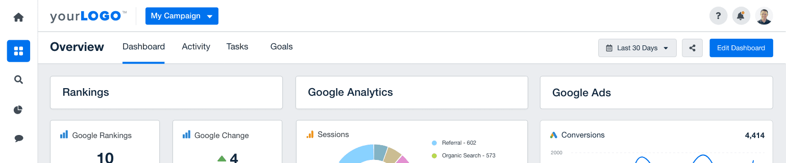
For example, with our Google Analytics integration, you can track sessions by source including organic search, paid search, and so on.

Heat Maps
A heat map uses a range of colors, from cooler colors (blues) to hotter colors (reds) to indicate the popularity of specific places on a map or website. Tools such as HotJar do a great job of visualizing how users behave on your client’s website.
Bubble Charts
A bubble chart is a type of graph that uses bubbles to represent data values. The size of the bubbles typically represents the magnitude of the data, while the position of the bubbles represents the relationship between the data points. Bubble charts can be used to visualize all sorts of data, from financial data to client campaign metrics.
Infographics
An infographic is a visual representation of data, information, or knowledge. It typically uses images, graphics, and text to convey complex ideas in a clear and engaging way. Although not commonly used in client reporting, with the right combination of visuals and text, infographics can help to engage clients and promote a deeper understanding of a wide variety of topics.

Bar Charts
Bar charts are an easy and effective way to visually represent data. They consist of a series of bars, each of which represents a specific category. The length or height of each bar corresponds to the value associated with that category. When used effectively, they can be great data analytics tools for extracting business insights and making data-driven decisions. Which is one of the reasons they are one of the most popular data visualization options used in client reporting.
For example, horizontal bar charts can be useful with Google Search Console to display the proportional amount that each landing page contributed to the whole in terms of impressions, clicks, and so on.

Bar charts are also useful when you want to illustrate the relation of each data point to all data points. For example, below is a bar chart comparing new and lost links with our backlink checker.

Scatter Plots
A scatter plot is a graph that shows the relationship between two sets of data. Each data point is represented by a dot, and the dots are usually plotted on a coordinate grid. The data points can be connected with a line to show the overall pattern, but the individual data points should not be connected.
Line Graphs
Line graphs can be used to show how something changes over time. For example, they can be used to show how people’s opinions change over time, or how your client’s social media metrics have improved (or declined) over time. To make a line graph, you often need only two things: the data and how you want to organize it.
If you’re tracking the change of a single metric over time, line charts are your go-to widget. These widgets are a great way to identify trends such as seasonality in the data. Line charts can also be compared against a previous time frame, allowing you to quickly compare data at a glance:

Area Charts
Area charts are a type of chart used for visualizing data. They are commonly used to display changes over time or in relation to a baseline, and they often show quantities that have increased or decreased over time.
Map Charts
Map charts provide the distribution of a given metric based on location. In Google Analytics, for example, you can select a metric under Audience -> Location and see where countries are contributing to the selected metric.

Gantt Charts
The Gantt chart is a great way to organize your agency's tasks and show how they're progressing throughout the project. It is one of the most popular types of project management charts, and it's also one that usually represents a lot of data!
Waterfall Charts
As the name suggests, waterfall charts depict data as a series of successive "steps," with each step representing a different stage or component of the overall trend or pattern. This makes them ideal for visualizing complex processes or relationships, as they provide a clear overview of all the individual components and how one variable impacts another over time. Waterfall charts are another very popular tool in the project management toolbox.
Table Charts
Table charts display a metric that is broken down by dimension and is useful when you want to see the exact value for each dimension. For example, table charts can be useful if you want to see the amount of social media engagement coming broken down each country and city.

Gauge Charts
Guage charts allow you to display a metric as a percentage of the whole. Gauge charts are useful if you want to show how well a category performed in comparison to the total or how well it performed on a given scale. For example, if you’re running a site audit, the tool provides an overall website score out of 100 percent.

Histograms
Histograms are graphical representations of data that can be used to analyze different patterns and trends in a dataset. They consist of bars or columns that show the distribution of values for each variable, typically with values on the horizontal axis and frequency on the vertical axis.
Stacked Column Charts
These “Stoplight‘ charts are used in our rank tracker for monitoring SERP data. These column charts allow you to visualize the distribution of rankings over time. If your clients want to track major changes in SERP rankings, these stacked column charts are well suited. These charts are also useful in conjunction with a line chart showing the Google Change in the search engine.

Stat Widgets
Stat widgets provide a single metric over a particular period. In addition to the raw data, stat widgets also provide a percentage change over the previous period.

Turning large data sets into visuals is an excellent way to help provide a clearer view of what the data means in relation to other metrics rather than simply listing off a bunch of numbers.
However, choosing the right widgets to display your data can be just as important as the data itself. In AgencyAnalytics, there are a variety of widget styles that offer a wide degree of flexibility in your interactive dashboards and reports. Specifically, widgets are broken down into three main categories:
Widgets with a dimension - used to display data that is separated by a range or category. For example, a dimension-based widget is useful if you want to break down data by age range, ranking group, or marketing channel.
Widgets without a dimension - used to display an entire data set that isn’t split into categories or ranges. These widgets are useful if you’re monitoring how a single metric is performing over time or at a snapshot in time.
Custom widgets - custom widgets help make a dashboard your own. Examples of custom widgets include adding titles to a dashboard, inserting infographics, creating call-out text boxes, and including images.
Data Visualization Best Practices
Now that we’ve reviewed the various types of data visualization charts and widgets you can use, let’s discuss a few best practices for agencies.
Mastering the art of creating impactful data visualizations requires time, practice, and good data visualization tools. With the abundance of data sources available today, data analysts must navigate vast amounts of information and extract meaningful insights.
When it comes to data visualization best practices, understanding the role of discrete and continuous data is also crucial. Discrete data, the countable integers you grappled with during high school math, brings clarity and simplicity. Think website visitors, total sales, and new customers. After all, you can't acquire half of a customer.
On the flip side, continuous data offers precision and depth by getting into the nitty gritty of conversion rates, average order values, and other calculated metrics. A holistic visualization strategy seamlessly blends these two, leveraging the distinctiveness of discrete data with the granularity of continuous data. By honing their skills in analyzing data and harnessing visualization techniques, they create interactive data visualizations that unlock the true potential of business intelligence. Although the learning curve may be steep, the result is well worth the effort, as these visualizations empower decision-makers with clear and concise information, make data-driven choices, and drive success in their organizations.
Here are a few of the best practices when it comes to using data visualization tools to take your data analytics game up a level (or four).
Add Context & Highlight KPIs
Since many clients often won’t have the technical expertise in marketing that you do, one of the most important things to do is add context and highlight the KPIs that are important that month. For example, all our monthly marketing report template starts off with a written section that includes:
A monthly summary
Recommendations for the account
Work accomplished this month
Targets for next month

The point is that whenever a chart may be overly technical, you may want to accompany it with a text box that provides an explanation of the data's meaning and relevance to their overall business objective.

Sometimes, it's not enough to simply create data visualizations and hope that they tell the story on their own. Business intelligence is about more than putting numbers into a pretty chart. Make sure the data visualization solution you choose has the ability to add context that helps clarify the visuals and make them more meaningful.
Choose the Right Visual for Your Purpose
It's important to pick the right data visualizations to match the metrics. If you have a limited number of data sets and what to show how each piece makes up the whole, a pie chart would be the way to go. if you need to show progression over time, try a line chart or bar chart. To show both, a stacked column chart often works well.

Think about the type of data, how many data points you need to display, and what your client would like it to be compared to when deciding on which type of visual to include in your reports.
And when you are communicating with your client, either left to right or right to left, make sure that you have your data visualizations are set the same way.
The sequence in which we present data, the colors we use, the typeface we employ, and several other features in charts and graphs will help clients more effectively interpret the data you're presenting.
Avoid Clutter & Information Overload
In addition to providing context to your clients, you also want to avoid overwhelming them with too much data and clutter. To do so, you generally just want to stick to a few colors in your data visualizations, use simple stat widgets wherever possible, and separate sections with clear titles.
The goal here is to give your clients an easy way to digest the most important metrics and KPIs, with the ability to dig deeper into the details if and when they want to. If you're utilizing many graphs, ensure sure the order is consistent, and the data showcased is clearly articulated.

Color also plays an important part in decluttering your data visualizations. Too many colors will make your reports feel messy and overwhelming, whereas not enough colors could cause the data to blend together and make it harder to highlight important data points.
Make Use of Data Storytelling
One of the most important parts of communicating your marketing results with clients is data storytelling. As discussed in our guide to data storytelling, this refers to taking data visualization a step further and adding a narrative in order to communicate the significance of the underlying changes.

The MIT Sloan teacher Miro Kazakoff calls data storytelling “the next chapter in analytics” and highlights that:
If you want people to make the right decisions with data, you have to get in their head in a way they understand. Throughout human history, the way to do that has been with stories.
In the realm of data science, the importance of telling a compelling data story cannot be overstated. While data sources provide valuable raw information, it is the art of weaving that data into a coherent narrative that truly brings it to life.
Data visualizations serve as the bridge between the raw information coming out of the various data sources and meaningful insights, providing a visual representation that is easily digestible and engaging.
By utilizing a data visualization tool designed to enhance data analytics, one transforms complex data sets into intuitive visuals that convey patterns, trends, and relationships.
Without context or narrative, data sits dormant, failing to captivate or inspire action. However, when data is presented in a compelling story, it becomes a powerful tool for decision-making, unlocking the full potential of their data-driven endeavors.
One of the best ways to tell a story with AgencyAnalytics is to add annotations and goals to your charts. For example, if you’re managing a Google Ads campaign for your clients, highlighting important changes to the account such as budget changes or new campaign launches provides a much more complete picture than just the chart itself.

To do so, simply open up the widget’s settings and you’ll see an option to add annotations and goals in all date-based line and column charts.

Increase Client Retention By Automating Your Client Reporting
Start Your Free 14-day TrialOther Standalone Data Visualization Tools
If you're looking to pull analytics from other data sources or visualize other data points that can't be automatically populated using one of AgencyAnalytics' 80+ marketing integrations, here are some of the best standalone data visualization software tools on the market today.
However, keep in mind that because of the time and effort that is needed to gather and collate the data prior to visualization, these data visualization tools should be used sparingly and only when automated client reports simply won't do.
ChartBlocks
If you're looking for data visualization software that is both easy to use and has a wide range of customization options, ChartBlocks is a great option. Chartblocks is a free online tool that lets you design and share charts with your clients. You can easily pull data from almost any source, making it perfect for marketers who want to engage their audience through visualizations. The Data Import Wizard takes agencies step by step through the process of importing their data into ChartBlocks so that it can be turned into visuals.
Pricing: Ranges from a limited free version to $65/month
Google Charts
Google Charts is a free version of a data visualization tool that can be used to create a variety of charts, including line charts, bar charts, pie charts, and more. You can also customize the look of your charts, and add labels, legends, and other annotations. Google Charts is free and simple to use if you need to turn some offline data into a quick visualization, which you can then embed into your website or client reports.
Pricing: Free
Infogram
Infogram is a cloud-based data visualization software that enables users to create highly engaging infographics, charts, and reports. The platform provides users with a wide range of templates, icons, and colors to choose from, making it easy to create professional-looking visuals. Additionally, Infogram offers a variety of features designed to help users communicate their data effectively, including the ability to add links, videos, and images. With its simple interface and powerful features, Infogram is an essential tool for anyone looking to tell a data-driven story.
Pricing: The Basic version is Free. The highest published price is $149/month, but there are also custom packages available.
Microsoft Excel
While not specifically designed for data visualization, Microsoft Excel is still one of the most popular data tools on the market today. With a variety of built-in chart options, you can quickly turn complex data sets into attractive visuals for your client.
Pricing: Microsoft Excel can be purchased for $159.99, or you can get it as part of Microsoft Office 365.
HubSpot
HubSpot is a powerful marketing and sales tool that can help you close more deals and better understand your customers. But did you know that HubSpot can also be used for data visualization? The built-in charts and graphs inside the HubSpot user interface can help you turn your data into actionable insights. Plus, HubSpot integrates seamlessly with AgencyAnalytics.
Pricing: Starts at $45/mo and can go well over $4,000 per month at the enterprise level.
Tableau
Tableau is a powerful data visualization tool that can be used to gain valuable insights from large, complex datasets. Whether you're looking to spot trends, identify correlations, or make predictions about the future, Tableau can help by simplifying and clarifying large amounts of data in an intuitive and user-friendly format. However, because of the steep learning curve, Tableau is typically more suited for an expert data analyst and is more robust than your typical agency would require.
Pricing: The lowest tier is $15 per user per month and scales up to $70 per user per month.
Datawrapper
If your agency is looking for a simple and easy way to create charts, maps or graphs then Datawrapper could be the right fit for you. You can either upload your own data from Excel sheets & Google Sheets (or any other file type) or use live URL links that will update automatically as new updates are made available online. It offers a relatively basic free plan as well as paid plans that have increased capacity per month.
Pricing: Offers a free version with limited capabilities, or custom packages starting at $599/month.
Easy Insight
With Easy Insight, you can create reports and dashboards to monitor your company's data. You'll be able to visualize it in charts or tables with this cloud-based business intelligence tool. It also has features that let different services come together into a single view of customers across multiple apps.
Pricing: The individual package is $29/month and it ramps up to $1,499/month for the Unlimited plan.
Visme
An online tool that makes it easy to create engaging visuals for a variety of different purposes. Whether you need to create an infographic, a presentation, or a social media post, Visme allows you to easily design and customize your own projects from start to finish. With a huge library of templates and graphics, plus user-friendly drag-and-drop functionality, Visme makes it simple for data scientists to bring their data ideas to life.
Pricing: The basic version is free and the business version is $24.75 per user per month, with custom quotes available at the enterprise level.
Sisense
A business intelligence tool that helps users to visualize and analyze data, Sisense offers users an easy-to-use drag-and-drop interface. It also features a wide range of dashboards, filters, and custom reports. Sisense is particularly well suited to businesses or agencies with very large amounts of data, as it can handle billions of rows of data.
Pricing: Not published on the site, you need to submit a quote form.
Zoho Analytics
With its drag-and-drop interface, you can quickly and easily create visuals that tell a data-driven story. Additionally, Zoho Analytics offers a variety of features designed to help users communicate their data effectively, including the ability to add links, videos, and images. With its simple interface and powerful features, Zoho Analytics is a good tool for simplified data visualization.
Pricing: The basic package starts at $24/month, while their most popular Premium version will set your agency back $115 per month.
Microsoft Power BI
Power BI is a data visualization tool from Microsoft that enables users to create stunning visuals from complex data sets. This modern, self-service interface lets your turn data into visualized insights and analytics through live dashboards and reports. Although it does take a bit of getting used to, overall Microsoft Power BI is not difficult to use.
Pricing: Ranges from $9.99/month per user, but can scale up for larger organizations to nearly $5,000 a month based on capacity.
Salesforce
Salesforce is much more than a data visualization platform, but it does include essential visualization tools for turning big data into digestible visuals. These can be very handy when explaining Salesforce metrics and data to clients. With Salesforce, you can create custom charts and dashboards to help make data more digestible. Additionally, Salesforce integrates seamlessly into the AgencyAnalytics platform.
Pricing: Because Salesforce does so many things, there are simply too many pricing options to detail them all here!
While there are many interactive data visualization tools on the market today, AgencyAnalytics makes it easy to add data visualizations to your reports with our automated reporting features, prebuilt report templates, customizable marketing dashboard templates, and a wide range of interactive widgets.
No need to copy and paste data or upload CSV files, simply connect your data sources to the analytics platform and let AgencyAnalytics do the rest! Not to mention, our data visualization tools are fully customizable, so you can tailor them to fit your specific needs.
Summary: The Best Data Visualization Tools for Agencies
In the data-driven world of marketing today, data visualization is an essential skill for agencies. By combining data, visuals, and a natural language narrative, agencies are able to communicate their results to clients in a much more effective way.
Data visualization is also a powerful tool for marketers because it removes many of the technical barriers related to data analysis and enables better decision-making. In many cases, this includes pulling the data in real time, using an API or SQL query behind the scenes to enable charts, tables, and graphs automatically.
That said, interactive charts alone don't provide much value to clients if you don't combine them with a narrative that relates the data back to the client's overall business objectives so that you can make informed decisions.
Ready to try out some of these data visualizations for your own client reports? Take AgencyAnalytics for a test drive with our 14-day free trial.

Written by
Paul Stainton is a digital marketing leader with extensive experience creating brand value through digital transformation, eCommerce strategies, brand strategy, and go-to-market execution.
Read more posts by Paul Stainton ›What Other Agency Experts Are Reading…

27 Best Marketing Analytics Tools for Agencies
There are several marketing analytics tools that can help you monitor your performance, identify opportunities for improvement, and keep your team organized. We’ll take a look at 27 of the best marketing analytics tools for agencies, based on features, pricing, and customer satis

13 Important Social Media Metrics to Track the ROI for Your Clients
Here is a list of the top 13 social media metrics your agency should track to maximize your client’s ROI and retain them for the long haul.

White Label Marketing Tools Growing Agencies Need
Explore essential white label marketing tools that are a game-changer for growing agencies. Learn how these tools elevate your services while saving time and effort.
Get Started for Free