Spotlight success with marketing data visualization software

Turn data into clear, visual insights with built-in data visualization tools
Showcase your agency’s impact with dashboards and reports built for clarity. Visualize marketing performance across Google Ads, SEO, social, and CRM platforms—all in one place. Drag, drop, and customize key metrics to spotlight exactly what matters to each client.
Visualize Marketing Data
Transform ad spend, SEO, and social media data into clear performance insights
Drag, Drop, Done
Build dashboards with customizable widgets—no code or design skills needed
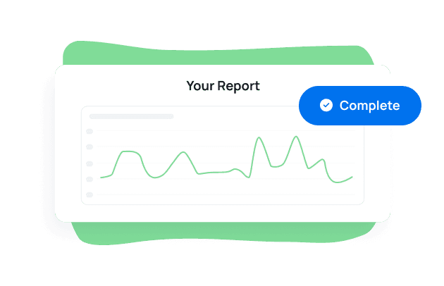
Share Insights Instantly
Deliver client-ready dashboards and reports in just a few clicks
Focus on What Matters
Pinpoint campaign results and KPIs that align with your clients' goals
Cut Through the Noise With Clear Visual Insights
Data means nothing if clients can’t interpret it. That’s why agencies use AgencyAnalytics as their go-to data visualization software—built to make performance trends, KPIs, and campaign results easy to understand.
Whether you're showing the breakdown of Google Ads spend with a pie chart, highlighting SEO growth with a line graph, or comparing regions using map visualizations, every visual element is designed to reinforce your agency’s value.

Transform Raw Metrics Into Client-Ready Dashboards
Create visualizations that bring clarity to complex metrics. AgencyAnalytics helps agencies clean up messy data and turn it into polished, client-ready charts and graphs.
Choose from a range of visualization types—including pie charts, bar graphs, gauge charts, and more—so clients see exactly how campaigns are driving results.

Highlight What Matters With Interactive Charts
Swap static tables for interactive visualizations that help clients explore performance trends on their own.
Visualization tools like line graphs, map charts, and multi-metric bar charts make it easy to connect marketing activity to outcomes. Agencies use these interactive charts to reinforce client trust through transparency and real-time access.

Build Powerful Visuals—No Data Science Degree Required
Most data visualization tools are built for analysts. AgencyAnalytics is built for agencies. Create visualizations with simple drag-and-drop controls, without coding or SQL.
The agency-focused platform is a powerful tool for visualizing data from 85+ marketing sources—perfect for busy account managers who need to turn insights into action, fast.

Show Campaign Wins Clients Instantly Understand
Show clients exactly what’s working—without overwhelming them. Use charts, graphs, and custom layouts to support strong data storytelling across SEO, PPC, email, and more.
In a few clicks, transform dashboards into professional reports that reinforce your agency’s value and help clients stay focused on results, not noise.

Visualize performance to impress clients and prove your agency’s value.


Discover the white label reporting tool trusted by 7,000+ marketing agencies.


FAQs About Marketing Data Visualization Software
Looking to turn complex marketing data into clear visuals? These FAQs explain what data visualization software does, why it matters, and how to choose the right solution for your agency.
Data visualization software helps you transform raw marketing data into a visual form that’s easier to understand and act on. AgencyAnalytics offers a purpose-built agency data visualization solution, helping marketing teams to build interactive dashboards and client-ready reports with just a few clicks.
Data visualization simplifies data analysis and helps agencies present performance results more effectively. Digital marketers organize data, spot trends, and uncover market insights that drive informed decisions. It simplifies complex information and enables marketers to monitor campaign performance, understand customer behavior, and align reporting with business intelligence goals—all through a visual, intuitive layout.
With support for data integration across multiple data sources, it enables marketing teams to organize information, communicate campaign success, and uncover trends using meaningful visual representations—making it a critical part of any data-driven strategy.
The biggest benefits include faster data exploration, clearer communication, and time saved on reporting. With AgencyAnalytics, marketing teams use data visualization tools to turn big data into actionable insights—without relying on Microsoft Excel or other tools that require advanced formatting or formulas.
Data visualization in marketing helps teams track performance, identify trends, and communicate results clearly to clients. Whether you’re presenting KPIs in a slide deck or pulling campaign data into a live dashboard, marketing analytics visualization makes it easier to understand data and make better decisions, faster.
Yes. Easily integrate data from Google Analytics, Google Ads, Facebook, LinkedIn, and other sources to compare values across different marketing channels and campaigns and create intuitive dashboards. You can even import custom data from Google Sheets and create data visualizations to create a complete client reporting package. Whether you're tracking leads generated, conversion rates, budgets, or performance metrics, the right data visualization tool helps you uncover hidden patterns and get a complete picture of your agency's marketing efforts.
Visualize performance across marketing campaigns and channels, analyze campaign-level data points, and present findings in a visual format that highlights trends and drives results.
Five popular techniques include bar charts, line graphs, pie charts, map charts, and stacked charts. These are the best data visualization tools for comparing performance across campaigns, tracking growth over time, and exploring different types of marketing data without digging through spreadsheets.
Whether you’re analyzing direct traffic or running campaign performance reviews, these charts help you spot trends and gain deeper insights.
AgencyAnalytics streamlines the process of transforming raw data into clear visual representations. By integrating data points from multiple data sources, the platform enables marketers to move from manual data analysis to real-time insights that support smarter decisions across digital marketing campaigns.
AgencyAnalytics turns raw numbers into visually appealing charts and graphs, helping agencies communicate complex data clearly and effectively. With custom widgets and dynamic visualizations, marketers extract insights from large datasets and make data-driven decisions—fast.
AgencyAnalytics starts at $59 per month. Compared to manual reporting and data visualization in tools like Microsoft Power BI, Excel or other data visualization tools, agencies save hours every week by switching to automated dashboards—freeing up time for strategy, content creation, and client engagement.
Definitely. While Looker Studio is a popular data visualization tool, AgencyAnalytics offers a more user-friendly interface with purpose-built dashboards, customizable layouts, and advanced visuals. Easily organize data from multiple campaigns and sources in just a few seconds—no design or coding skills required.
AgencyAnalytics offers purpose-built marketing dashboards with built-in data integration, user-friendly customization, and faster setup. Presenting data from multiple data sources becomes easier, making it ideal for agencies managing digital marketing efforts at scale.
Look for visualization tools that are built for agencies—offering real-time dashboards, customizable layouts, and integrations with your marketing stack. AgencyAnalytics combines ease of use with powerful visualization tools to help you understand data, manage massive amounts of client info, and deliver better reports. Try it free for 14 days and see how fast and simple your reporting process can be.
More features
Smart Reports

AI Reporting Tools
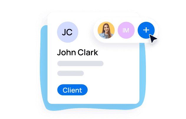
Tasks

Mobile Interface
Client Portals
